
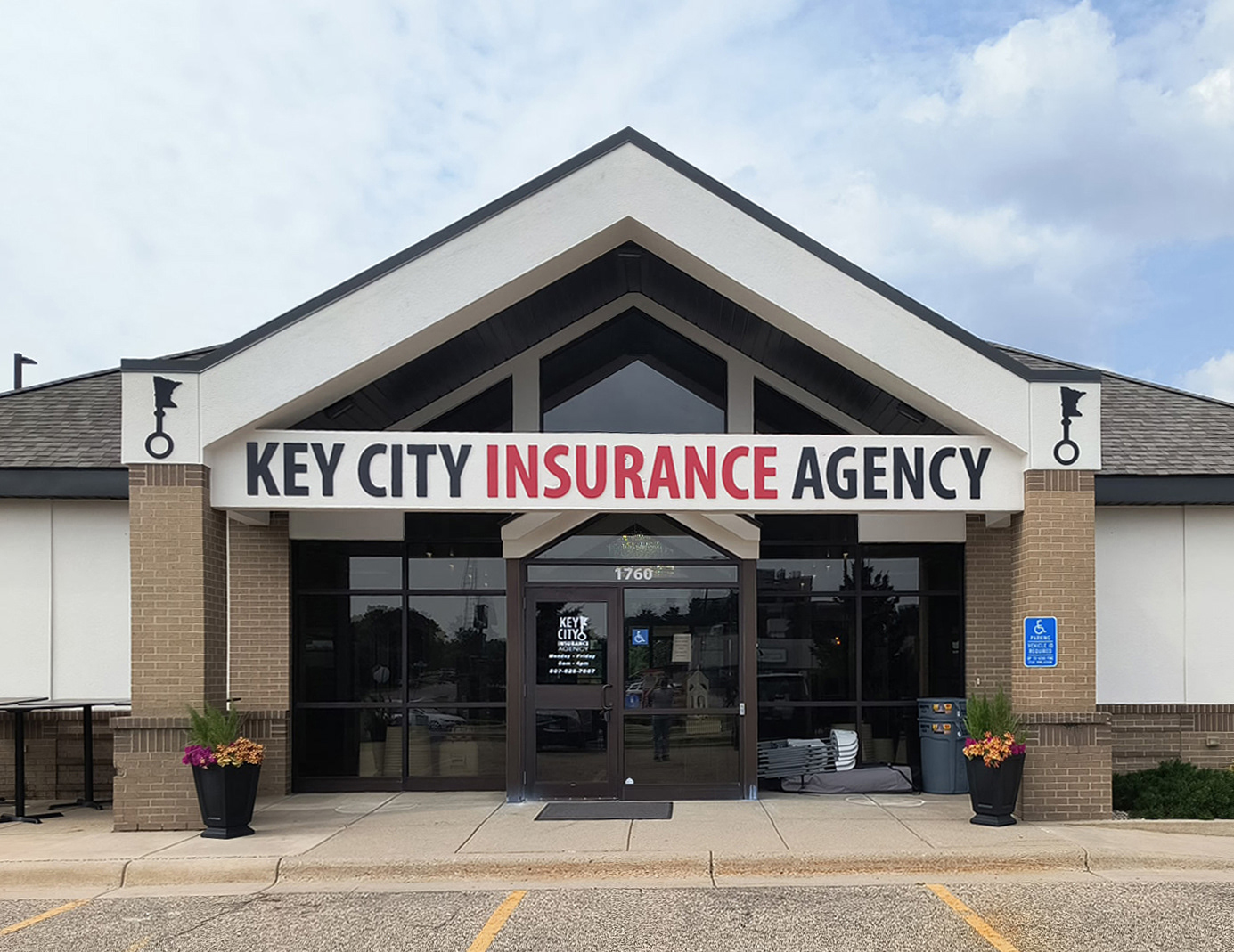
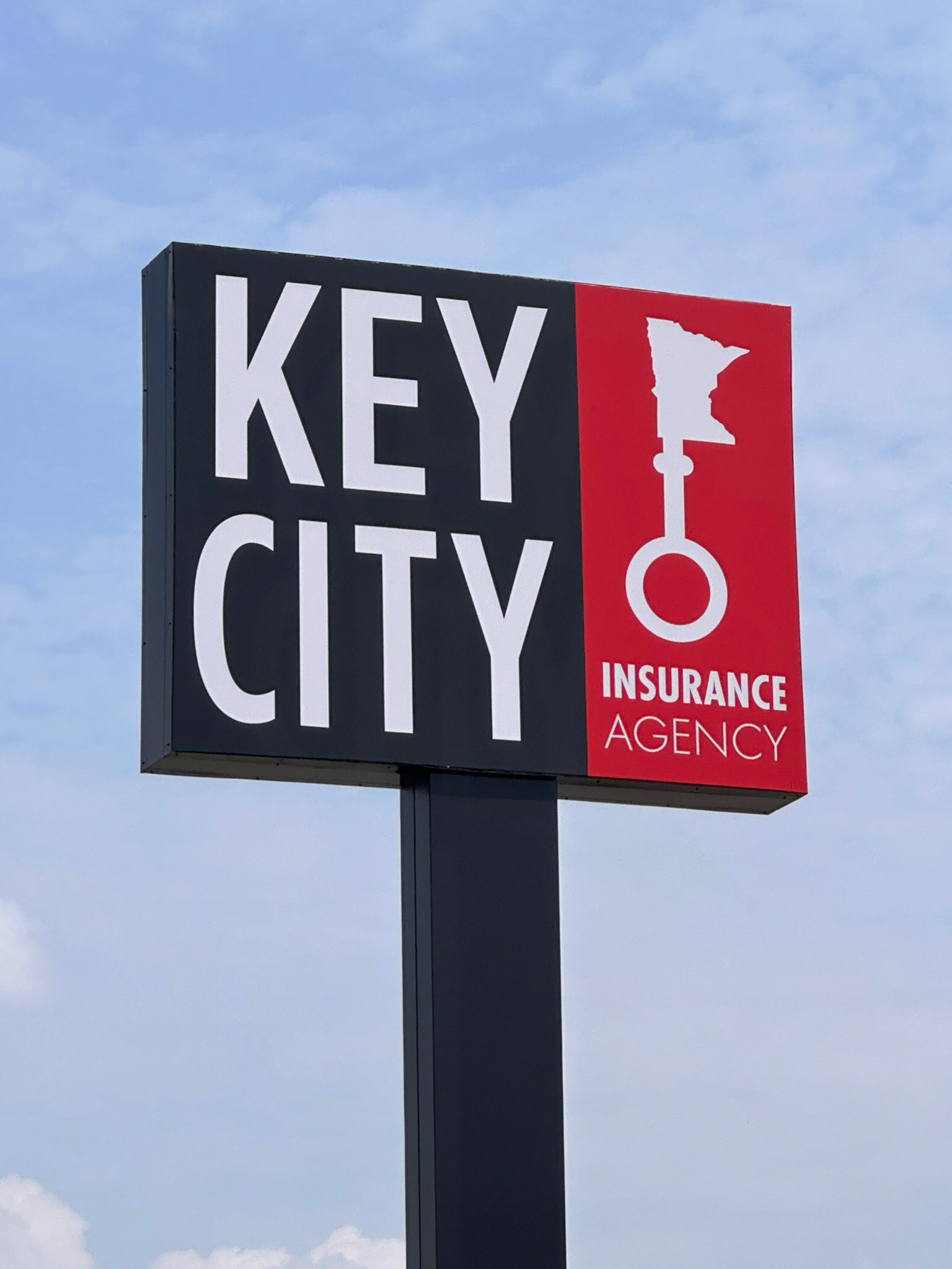
I refreshed the existing Key City Insurance Agency logo with a cleaner, more contemporary look while maintaining the familiarity and recognition of the original identity. The updated logo was then brought to life on an extremely large internally illuminated cabinet sign, creating a bold focal point that makes the agency highly visible from the highway.
For the building façade, I developed a complementary signage system featuring large dimensional lettering and custom-cut graphic shapes that extend the updated identity across the front of the building. The combination of illuminated signage, dimensional elements, and the refreshed logo creates a cohesive exterior presence that feels professional, modern, and highly visible.
The project demonstrates how a thoughtful logo update can translate into large-scale environmental graphics, giving a familiar brand a fresh presence while working within the practical demands of architectural signage.